
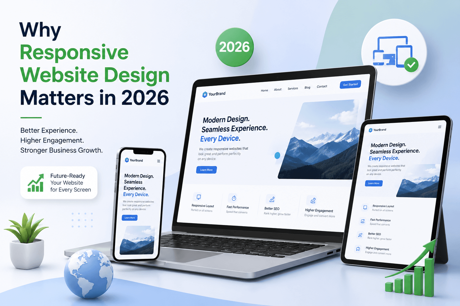
In today's digital-first world, your website is often the first impression your business makes. And with users browsing on phones, tablets, and desktops, responsive website design is no longer optional—it's essential. At Ganpati Infosolutions, we specialize in creating fast, user-friendly, and fully responsive websites that drive results.
What is Responsive Website Design?
Responsive design means your website adapts to any screen size—automatically adjusting layout, images, and content for the best viewing experience. Whether your visitor is using a smartphone or a large monitor, your site will look great and function perfectly.
Benefits of Responsive Design
1. Improved User Experience
Visitors stay longer and interact more with websites that are easy to navigate on any device. A smooth mobile experience increases engagement and reduces bounce rate.
2. Better SEO Rankings
Google favors mobile-friendly websites. A responsive website helps improve your visibility in search engine results and contributes to overall SEO performance.
3. Faster Load Times
Responsive websites are optimized for performance. Faster loading pages = happier users and higher conversion rates.
4. Cost Efficiency
Instead of building separate versions for desktop and mobile, responsive design gives you one flexible solution that works everywhere.
Our Expertise in Responsive Design
At Ganpati Infosolutions, we use cutting-edge tools and frameworks like Laravel, WordPress, Magento, and Shopify to develop modern, scalable websites. Whether you need a business website, a school portal, or a custom eCommerce store, we ensure your site is optimized for all screen sizes.
Real Results for Real Clients
We’ve helped dozens of clients improve their online presence through responsive design:
- Cookme – a Laravel-based eCommerce site with smooth mobile checkout
- Wise Owl Talks – a WordPress site optimized for course material on mobile
- School Portals – with easy navigation for parents and teachers on any device